Lead generation landing pages play a key role in the sales process. From collecting prospects’ data and demographics to essential insights they act as conversion triggers.
Most sales advertising campaigns direct to a specific landing page instead of a homepage. So the activity and demographics of the coming visitors are easy to track through different pixels.
Transformation of raw traffic into leads is an art. So you need to focus on the landing page design and key elements that boost the conversion rate.
Article Summary:
“Lead generation landing page is a specific type of web page that is created to collect information about potential buyers. Users are encouraged to give their contact details for incentives called lead magnets. Such pages vary for different industries, we have tried to discuss their popular examples and best practices in this blog post.”
What Are Lead Generation Landing Pages?
Lead-collecting pages are the starter part of a conversion funnel. They are different from the checkout and cart pages of the website. Their prime objective is to collect the goal-oriented data of potential clients.
It may be a website page or a third-party resource that allows you to collect and analyze data. All sales marketing campaigns like email marketing, PPC ads, and social media ads usually concentrate on a call to action. That encourages people to visit lead generation landing pages.
Visitors willingly submit their details like name, email address, phone number, and business details like company size, location, and industry-related information through lead generation landing pages.
They may do this for any incentive like a free trial, discounts, and limited-time offers. In some cases, it may be a newsletter subscription, sign-up forms, and buy-now CTAs. This raw data is processed for lead qualification and nurturing to close more sales.
Also Read: Landing Page Statistics You Should Know
8 High Converting Lead Generation landing Page Examples And Templates
A well-crafted lead generation landing page can boost your conversion rate. Each visitor on your site matters, get their contact information and convince them to convert. Here 8 best lead generation landing page examples and templates you can get the ideas.
1. NetSuite Business Guide
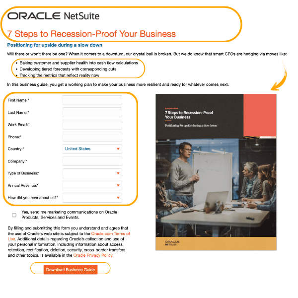
NetSuite is a famous software solution by Oracle that is attracting struggling businesses with its guide. Their prime objective focuses on businesses looking for sustainability and growth.
Upsides:
- Clear headlines with branding
- Short overview of things covered to hook
- Good form placement with a custom image
- Terms and Privacy Policy disclosure
- Well-placed CTA at the form bottom
- Optimized for mobile experience
Downsides:
- Too stuffy with a lot of form sections
- All the form inputs are mandatory
- Complex landing page URL
2. Sprout Social B2B Content Worksheet
Sprout Social is a famous social media scheduling and management tool that allows you to manage multiple social profiles in one place. They are probably collecting data from B2B clients who may be interested in purchasing social media tools.
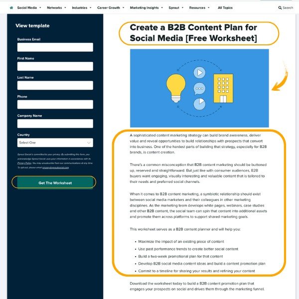
Their lead gen landing page offers a free worksheet incentive by adding some personal and business data. That will help in lead qualification and sales pitching later on.
Upsides:
- Bold, simple, and straightforward headline with a hook {Free Worksheet}
- Overview of the incentive in short paragraphs and bullet points
- Relatively concise form inputs
- Terms and Privacy Policy disclosure
- Well-placed and clear CTA
- Optimized for mobile experience
Downsides:
- More textual content and big paragraphs without highlights
- Users need to scroll to read all the text
- Can remove the second name input and change the first name to full name
3. Asana product Demo Template
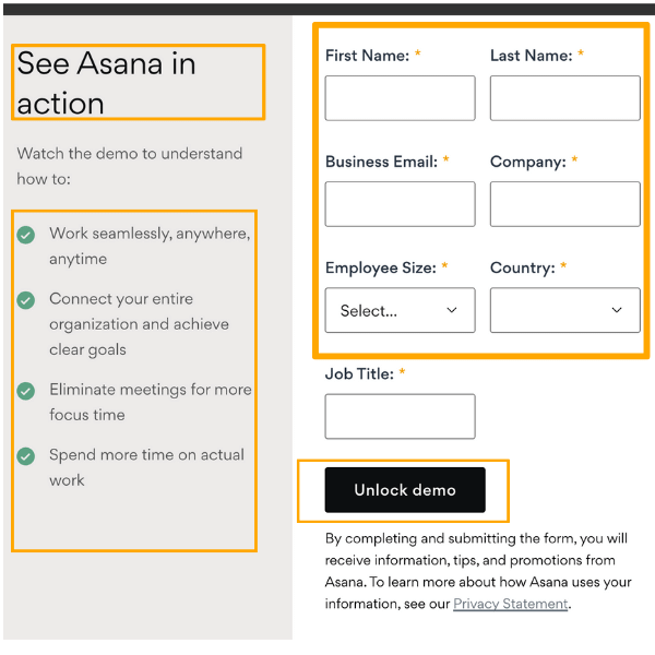
Asana helps businesses manage their connectivity and meetings from anywhere. They are collecting key data for lead qualification by giving free product demos.
Upsides:
- Short headline with a hook {See In Action}
- Overview of the product features in bullet points
- Relatively concise form inputs
- Terms and Privacy Policy disclosure
- Short and clear CTA
- Optimized for mobile experience
Downsides:
- The main headline should be a little bolder
- Can add a couple of lines in the paragraph before bullet points
- The bullet point icon color can be replaced with Asana’s branding
4. HubSpot Free Demo Landing Page
HubSpot is the most used SaaS tool in marketing, sales, and customer service-related needs. Their landing page offers free product demos by filling out a lead collection form.
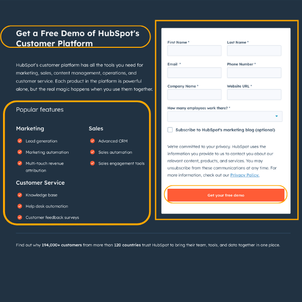
Upsides:
- Bold headline with a hook {Free Demo}
- Overview of the key features in bullet points
- Concise form inputs
- Terms and Privacy Policy disclosure
- Short and clear CTA
- Well-optimized design for mobile experience
Downsides:
- The landing page background and branding contrast seem creepy
- The call to action font should be bolder
- No images and icons were used on the page
5. Workable Free Trial Sign-Up
Workable gives complete hiring solutions from posting jobs, conducting interviews, and creating reports in one place. They are trying to collect leads through a 15-day free product trial incentive.
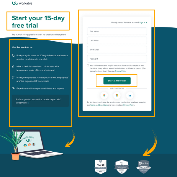
Upsides:
- Catchy headline with a hook {15 days free trial}
- Key features overview that can be used during this free trial
- Strong bullet points with creative icons
- Fair use of images and icons
- Awards and certification badges are placed at the bottom
- Optimized for mobile experience
- Terms and Privacy Policy disclosure
Downsides:
- Fewer form inputs for the qualified leads funnel
- Background contrast with the branding can be improved
- The body font size should be more assertive
6. Adobe Experience Cloud Report Template
Adobe is a popular marketing and design solutions provider. In the below lead gen form, they are collecting those clients data who are searching for B2B marketing automation platforms.
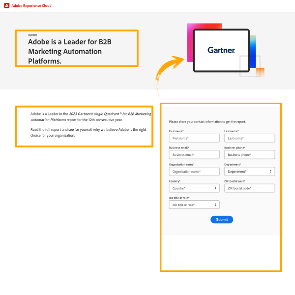
Upsides:
- Bold and crisp page headline
- Good use of the featured image at the top of the page
- Lead qualification inputs
- Sharp CTA
- Well-optimized for mobile experience
Downsides:
- No Terms and Privacy Policy Disclosure
- Less textual content and no bullet points
- The CTA button can be improved
7. SalesForce Free Trial Landing Page
SalesForce is a cloud-based customer service and marketing automation services provider. They are proposing a 30-day free trial by filling out their lead generation form.
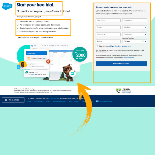
Upsides:
- Bold and catchy page headline with a hook {Free Trial}
- Overview of the product features in bullet points
- Creative use of graphics in the design template
- Terms and Privacy Policy disclosure
- Pushing CTA, encouraging to take action
- Optimized for mobile experience
Downsides:
- The logo placement of SalesForce can be changed
- Background and template color combination seem monotonous
- Can put a link on the phone number for direct dialing
8. backlinko’s Newsletter Sign Up
Backlinko is renowned for data-driven and research-oriented SEO advice. That primarily focuses on Off-page and link-building strategies. They are using the below lead gen form to increase their newsletter subscribers.
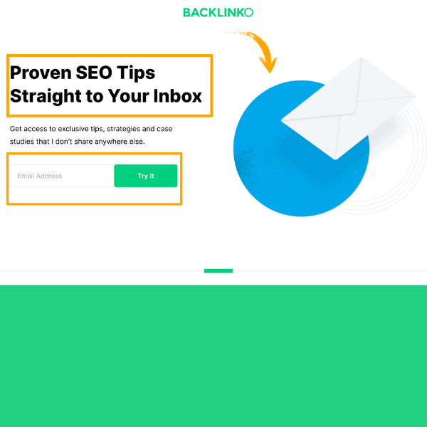
Upsides:
- Bold and creative headline with suspense {Proven}
- Single input form element
- Well-placed branding and visual creatives
- Crisp and pushing CTA
- Optimized for mobile experience
Downsides:
- Can add newsletter content overview in bullet points
- Should use a minimum 2 form inputs for sales perspective
- Can mention the number of existing newsletter subscribers in bold at the start
Best Practices To Create Catchy Lead Generation Landing Pages
The conversion rate and effectiveness of lead-generation landing pages depend on several factors. Here are some best practices for creating a well-optimized landing page.
Offer Incentives And Value To Visitors
Encourage your website or landing page visitors to fill out the lead generation forms for incentives like free trials, product demos, cheat sheets, checklists, and product guides.
Use countdown times for limited time and exclusive offers. It creates a sense of urgency and pushes them to act.
Particular Landing Pages For Different Audience Personas
If you are targeting multiple audiences then create a personalized audience through segmentation. Then design a particular landing page for each segment. That should be according to their interest and enhance the prospects of engagement.
Single Creative and Encouraging Call To Action
There should be one CTA in the entire landing page design pushing the visitors to take action. Multiple calls to action divert the attention and confuse the visitors.
Take Edge of Assertive Copywriting
Use the attention-grabbing power words and hooks in your headlines. Give a brief overview of the benefits visitors will get after submitting their information.
Avoid lengthy paragraphs with a lot of fluff that will badly impact the conversion rate. There should be exceptional copywriting along with creative and visual presentations.
Don’t Ask frictional Stuff
Only include limited and required inputs in your lead generation form. Asking for frictional stuff that most visitors avoid revealing will lower the conversion rate.
Optimize your Landing pages For Mobile Devices
Most of the visitors come from mobile devices, so your lead generation landing pages must be mobile-friendly. Customize them for all sorts of smart devices for seamless presentation of all the content.
Use Testimonials, Social Proofs, And Certifications
Testimonials, social proofs, and certification badges in landing page design increase credibility. That encourages visitors to submit their sensitive information like business emails, company details, etc.
Frequently Asked Questions
Wrap Up
In conclusion, all the above examples and templates are for optimizing your lead-generation landing pages. You can boost your conversion rate by adopting the latest copywriting trends and marketing techniques.
The prime intent of this exercise is to grow the customer base of any business. So they play a significant part in their marketing campaigns. Spend some money on well-crafted landing pages that convert the best.